pacman::p_load(ggcorrplot, ggplot2, tidyverse, scales, patchwork, ggridges, ggrepel, knitr, kableExtra)Visual Analytics for Motor Insurance Portfolio Discovery
1 Introduction
1.1 Background and Objectives
This report documents the complete visual analytics investigation of a real-world motor vehicle insurance portfolio from a Spanish non-life insurer. The dataset, sourced from Mendeley Data, contains policy-year records spanning 2022–2024 with information on policyholder demographics, vehicle characteristics, coverage types, premiums, and claims outcomes.
Investigation objectives:
- Apply univariate visual analytics to characterise the distributions and composition of numerical and categorical variables.
- Apply bivariate visual analytics to investigate and statistically validate factors influencing portfolio profitability (loss ratio, profit per policy) and volatility (claim frequency, claim severity).
1.2 Dataset Description
The dataset is organised into four variable groups as defined in the official data cookbook:
Policy and Insured Characteristics — variables describing the contract itself:
| Variable | Description |
|---|---|
insured_id |
Unique sequential ID per policy number; repeated policies share the same ID |
year |
Calendar year of the record |
policy_type |
Coverage structure: TP (basic liability), TPG (liability + glass), CC (liability + 2+ extra covers), COMP_N (comprehensive without excess), COMP_E (comprehensive with excess) |
policy_status |
Active (A) or Cancelled (C) at time of analysis |
business_type |
New Business (NB) or Portfolio renewal (P) |
payment_frequency |
Annual (A), Semi-annual (S), or Quarterly (Q) billing |
bonus_score |
Past claims experience: Good/G (favourable), Neutral/N, Bad/B (poor history) |
Driver and Vehicle Characteristics — risk-rating variables:
| Variable | Description |
|---|---|
driver_age |
Age of the main driver in years |
vehicle_age |
Age of the insured vehicle in years |
age_driving_licence |
Calendar year the licence was issued (not years of experience held) |
fuel_type |
Gasoline (G) or Diesel (D) only — other fuel types excluded |
vehicle_value |
Declared insured value; some entries missing |
seats |
Number of seats in the vehicle |
power_to_weight_ratio |
Approximate kg per horsepower — proxy for performance |
vehicle_brand |
Brand as reported in policy data |
municipality_type |
Inland (I), Coastal (C), or Islands (IS) |
circulation_area |
Predominant driving environment: Urban (U) or Rural (R) |
Premiums — eight coverage-level premium components that sum to total_premium: liability, property damage, theft, fire, glass, legal protection, occupants, plus the total.
Exposure, Claims and Incurred — outcome variables: total_exposure (policy years on risk, 0–1 for partial years, may exceed 1 for multi-year contracts), claim counts per coverage line, and incurred costs (paid amounts plus outstanding reserves) per coverage line.
2 Getting Started
Following R packages will be used:
tidyverse: Core data manipulation (dplyr, tidyr, readr, forcats, stringr)
ggplot2: Grammar of graphics visualisation engine
scales: Axis formatting helpers (percent, comma, dollar)
patchwork: Multi-panel plot composition
ggridges: Ridge / joy plots for distributional comparison
ggcorrplot: Correlation matrix heat maps
ggrepel: Non-overlapping text labels knitr: Table rendering in Quarto
kableExtra: Html table styling
Following code chunk defines visual style and color palettes to ensure all charts in the report look consistent.
# ── Global ggplot2 theme ─────────────────────────────────────────────────────
theme_ins <- function(base_size = 13) {
  theme_minimal(base_size = base_size) +
    theme(
      plot.title    = element_text(face = "bold", size = base_size + 1),
      plot.subtitle = element_text(colour = "grey50", size = base_size - 1),
      panel.grid.minor = element_blank(),
      legend.position  = "bottom"
    )
}

theme_set(theme_ins())

# ── Consistent colour palette ────────────────────────────────────────────────
pal_main  <- c("#1565C0","#1E88E5","#42A5F5","#90CAF9","#E3F2FD")
pal_div   <- c("#D32F2F","#EF5350","#EF9A9A","#BBDEFB","#42A5F5","#1565C0")
pal_cat5  <- c("#1565C0","#FF9800","#4CAF50","#F44336","#9C27B0")
pal_bonus <- c("Good (Favourable History)" = "#4CAF50", Neutral = "#FF9800", "Bad (Poor History)" = "#F44336")
pal_area  <- c(Urban = "#FF9800", Rural = "#1E88E5")
pal_fuel  <- c(Gasoline = "#FF9800", Diesel = "#1E88E5")
3 Data Preparation
3.1 Loading Data
Following code chunk loads data into R environment as df_raw, read_delim() is used instead of read_csv() because the file uses semicolons as separators — common in European CSVs where commas are used as decimal points. show_col_types = FALSE suppresses the column-type printout.
#Reading the data into R environment
df_raw <- read_delim(
  "data/Dataset_of_motor_insurance_portfolio.csv",
  delim = ";",
  show_col_types = FALSE
)
3.2 Variable Classification
Following code chunk builds a metadata table about the dataset itself, enriched with variable descriptions from the official data cookbook. Key functions:
names(df_raw)— extracts all column namessapply(df_raw, class)— appliesclass()to every column to get its data typecase_when()— tidyverse’s multi-conditionif-else, here used to classify each variable into the four analytical groups defined in the cookbook: Policy and insured characteristics, Driver and vehicle characteristics, Premiums, and Exposure, claims and incurredstr_detect(Variable, "premium")— regex match to catch all premium-related columns without listing them individuallycolSums(is.na())— counts missing values per column
| Variable | Type | Description | Group | Missing_N | Missing_Pct |
|---|---|---|---|---|---|
| insured_id | numeric | Unique sequential identifier per policy number | Policy & Insured Characteristics | 0 | 0.00% |
| year | numeric | Calendar year of the policy record | Policy & Insured Characteristics | 0 | 0.00% |
| policy_type | character | Coverage structure: TP / TPG / CC / COMP_N / COMP_E | Policy & Insured Characteristics | 0 | 0.00% |
| policy_status | character | Active (A) or Cancelled (C) at time of analysis | Policy & Insured Characteristics | 0 | 0.00% |
| business_type | character | New Business (NB) or Portfolio renewal (P) | Policy & Insured Characteristics | 0 | 0.00% |
| payment_frequency | character | Billing frequency: Annual (A), Semi-annual (S), Quarterly (Q) | Policy & Insured Characteristics | 0 | 0.00% |
| bonus_score | character | Claims history indicator: Good (G), Neutral (N), Bad (B) | Policy & Insured Characteristics | 0 | 0.00% |
| driver_age | numeric | Age of the main driver in years | Driver & Vehicle Characteristics | 0 | 0.00% |
| vehicle_age | numeric | Age of the insured vehicle in years | Driver & Vehicle Characteristics | 2 | 0.00% |
| age_driving_licence | numeric | Calendar year licence was issued (not years held) | Driver & Vehicle Characteristics | 2 | 0.00% |
| fuel_type | character | Vehicle fuel: Gasoline (G) or Diesel (D) | Driver & Vehicle Characteristics | 1287 | 0.36% |
| vehicle_value | numeric | Declared insured value of the vehicle (some missing) | Driver & Vehicle Characteristics | 513 | 0.14% |
| seats | numeric | Number of seats in the insured vehicle | Driver & Vehicle Characteristics | 0 | 0.00% |
| power_to_weight_ratio | numeric | Approx. kg per horsepower — proxy for vehicle performance | Driver & Vehicle Characteristics | 0 | 0.00% |
| vehicle_brand | character | Brand of the insured vehicle | Driver & Vehicle Characteristics | 0 | 0.00% |
| municipality_type | character | Geographic classification: Inland (I), Coastal (C), Islands (IS) | Driver & Vehicle Characteristics | 0 | 0.00% |
| circulation_area | character | Predominant environment: Urban (U) or Rural (R) | Driver & Vehicle Characteristics | 0 | 0.00% |
| total_premium | numeric | Sum of all individual coverage premiums | Premiums | 0 | 0.00% |
| liability_premium | numeric | Premium charged for third-party liability coverage | Premiums | 0 | 0.00% |
| property_damage_premium | numeric | Premium for property damage coverage | Premiums | 0 | 0.00% |
| theft_premium | numeric | Premium for theft coverage | Premiums | 0 | 0.00% |
| fire_premium | numeric | Premium for fire coverage | Premiums | 0 | 0.00% |
| glass_premium | numeric | Premium for glass coverage | Premiums | 0 | 0.00% |
| legal_protection_premium | numeric | Premium for legal protection coverage | Premiums | 0 | 0.00% |
| occupants_premium | numeric | Premium for personal-injury coverage of occupants | Premiums | 0 | 0.00% |
| total_claims | numeric | Total number of claims reported during exposure period | Exposure, Claims & Incurred | 0 | 0.00% |
| liability_claims | numeric | Count of liability claims | Exposure, Claims & Incurred | 0 | 0.00% |
| liability_property_claims | numeric | Count of liability_property claims | Exposure, Claims & Incurred | 0 | 0.00% |
| liability_injury_claims | numeric | Count of liability_injury claims | Exposure, Claims & Incurred | 0 | 0.00% |
| property_claims | numeric | Count of property claims | Exposure, Claims & Incurred | 0 | 0.00% |
| theft_claims | numeric | Count of theft claims | Exposure, Claims & Incurred | 0 | 0.00% |
| fire_claims | numeric | Count of fire claims | Exposure, Claims & Incurred | 0 | 0.00% |
| glass_claims | numeric | Count of glass claims | Exposure, Claims & Incurred | 0 | 0.00% |
| legal_protection_claims | numeric | Count of legal_protection claims | Exposure, Claims & Incurred | 0 | 0.00% |
| occupants_claims | numeric | Count of occupants claims | Exposure, Claims & Incurred | 0 | 0.00% |
| total_incurred | numeric | Total incurred cost: paid amounts plus outstanding reserves | Exposure, Claims & Incurred | 0 | 0.00% |
| liability_incurred | numeric | Incurred cost (paid + reserved) for liability claims | Exposure, Claims & Incurred | 0 | 0.00% |
| liability_property_incurred | numeric | Incurred cost (paid + reserved) for liability_property claims | Exposure, Claims & Incurred | 0 | 0.00% |
| liability_injury_incurred | numeric | Incurred cost (paid + reserved) for liability_injury claims | Exposure, Claims & Incurred | 0 | 0.00% |
| property_incurred | numeric | Incurred cost (paid + reserved) for property claims | Exposure, Claims & Incurred | 0 | 0.00% |
| theft_incurred | numeric | Incurred cost (paid + reserved) for theft claims | Exposure, Claims & Incurred | 0 | 0.00% |
| fire_incurred | numeric | Incurred cost (paid + reserved) for fire claims | Exposure, Claims & Incurred | 0 | 0.00% |
| glass_incurred | numeric | Incurred cost (paid + reserved) for glass claims | Exposure, Claims & Incurred | 0 | 0.00% |
| legal_protection_incurred | numeric | Incurred cost (paid + reserved) for legal_protection claims | Exposure, Claims & Incurred | 0 | 0.00% |
| occupants_incurred | numeric | Incurred cost (paid + reserved) for occupants claims | Exposure, Claims & Incurred | 0 | 0.00% |
| total_exposure | numeric | Effective time-on-risk in policy years (0–1, may exceed 1) | Exposure, Claims & Incurred | 0 | 0.00% |
| liability_exposure | numeric | Exposure associated with liability coverage | Exposure, Claims & Incurred | 0 | 0.00% |
var_types <- tibble(
  Variable = names(df_raw),
  Type = sapply(df_raw, class),
  Description = case_when(
    Variable == "insured_id"                  ~ "Unique sequential identifier per policy number",
    Variable == "year"                        ~ "Calendar year of the policy record",
    Variable == "policy_type"                 ~ "Coverage structure: TP / TPG / CC / COMP_N / COMP_E",
    Variable == "policy_status"               ~ "Active (A) or Cancelled (C) at time of analysis",
    Variable == "business_type"               ~ "New Business (NB) or Portfolio renewal (P)",
    Variable == "payment_frequency"           ~ "Billing frequency: Annual (A), Semi-annual (S), Quarterly (Q)",
    Variable == "bonus_score"                 ~ "Claims history indicator: Good (G), Neutral (N), Bad (B)",
    Variable == "driver_age"                  ~ "Age of the main driver in years",
    Variable == "vehicle_age"                 ~ "Age of the insured vehicle in years",
    Variable == "age_driving_licence"         ~ "Calendar year licence was issued (not years held)",
    Variable == "fuel_type"                   ~ "Vehicle fuel: Gasoline (G) or Diesel (D)",
    Variable == "vehicle_value"               ~ "Declared insured value of the vehicle (some missing)",
    Variable == "seats"                       ~ "Number of seats in the insured vehicle",
    Variable == "power_to_weight_ratio"       ~ "Approx. kg per horsepower — proxy for vehicle performance",
    Variable == "vehicle_brand"               ~ "Brand of the insured vehicle",
    Variable == "municipality_type"           ~ "Geographic classification: Inland (I), Coastal (C), Islands (IS)",
    Variable == "circulation_area"            ~ "Predominant environment: Urban (U) or Rural (R)",
    Variable == "total_premium"               ~ "Sum of all individual coverage premiums",
    Variable == "total_claims"                ~ "Total number of claims reported during exposure period",
    Variable == "total_incurred"              ~ "Total incurred cost: paid amounts plus outstanding reserves",
    Variable == "total_exposure"              ~ "Effective time-on-risk in policy years (0–1, may exceed 1)",
    Variable == "liability_exposure"          ~ "Exposure associated with liability coverage",
    str_detect(Variable, "^liability_p.*prem") ~ "Premium for liability property damage coverage",
    str_detect(Variable, "^liability_i.*prem") ~ "Premium for liability bodily injury coverage",
    str_detect(Variable, "liability_premium")  ~ "Premium charged for third-party liability coverage",
    str_detect(Variable, "property_damage_premium") ~ "Premium for property damage coverage",
    str_detect(Variable, "theft_premium")     ~ "Premium for theft coverage",
    str_detect(Variable, "fire_premium")      ~ "Premium for fire coverage",
    str_detect(Variable, "glass_premium")     ~ "Premium for glass coverage",
    str_detect(Variable, "legal_protection_premium") ~ "Premium for legal protection coverage",
    str_detect(Variable, "occupants_premium") ~ "Premium for personal-injury coverage of occupants",
    str_detect(Variable, "_claims$")          ~ paste0("Count of ", str_remove(Variable, "_claims"), " claims"),
    str_detect(Variable, "_incurred$")        ~ paste0("Incurred cost (paid + reserved) for ", str_remove(Variable, "_incurred"), " claims"),
    TRUE ~ Variable
  ),
  Group = case_when(
    Variable %in% c("insured_id","year","policy_type","policy_status",
                    "business_type","payment_frequency","bonus_score") ~ "Policy & Insured Characteristics",
    Variable %in% c("driver_age","vehicle_age","age_driving_licence","fuel_type",
                    "vehicle_value","seats","power_to_weight_ratio",
                    "vehicle_brand","municipality_type","circulation_area") ~ "Driver & Vehicle Characteristics",
    str_detect(Variable, "premium") ~ "Premiums",
    str_detect(Variable, "claims|incurred|exposure") ~ "Exposure, Claims & Incurred",
    TRUE ~ "Other"
  ),
  Missing_N = colSums(is.na(df_raw)),
  Missing_Pct = scales::percent(colSums(is.na(df_raw)) / nrow(df_raw), accuracy = 0.01)
)

kbl(var_types, caption = "Variable Classification and Missing Data Summary (Source: Mendeley Data Cookbook)") |>
  kable_styling(bootstrap_options = c("striped","hover","condensed"), full_width = FALSE) |>
  column_spec(4, bold = TRUE) |>
  scroll_box(height = "400px")
3.3 Feature Engineering
Derived variables are constructed to support the analytical objectives. The loss ratio (incurred ÷ premium) is the primary profitability metric in non-life insurance; claim indicator enables frequency modelling; profit facilitates absolute value analysis. Note that total_exposure — the effective time-on-risk expressed in policy years — ranges from 0 to 1 for partial-year policies and may exceed 1 for multi-year contracts. total_incurred captures both paid amounts and outstanding reserves, so it represents the full economic cost of claims, not just settled payments.
df <- df_raw |>
  mutate(
    # ── Temporal ──────────────────────────────────────────────────────────────
    year = factor(year),

    # ── Categorical recoding ──────────────────────────────────────────────────
    policy_type = factor(policy_type,
                         levels = c("TP","TPG","CC","COMP_N","COMP_E"),
                         labels = c("Third Party","Third Party+Glass",
                                    "Third Party+Multi-Cover","Comprehensive (No Excess)","Comprehensive (With Excess)")),
    policy_status = factor(policy_status, levels = c("A","C"),
                           labels = c("Active","Cancelled")),
    business_type = factor(business_type, levels = c("NB","P"),
                           labels = c("New Business","Portfolio")),
    payment_frequency = factor(payment_frequency,
                               levels = c("A","S","Q"),
                               labels = c("Annual","Semi-Annual","Quarterly")),
    bonus_score = factor(bonus_score, levels = c("G","N","B"),
                         labels = c("Good (Favourable History)","Neutral","Bad (Poor History)")),
    fuel_type = factor(fuel_type, levels = c("G","D"),
                       labels = c("Gasoline","Diesel")),
    municipality_type = factor(municipality_type,
                               levels = c("I","C","IS"),
                               labels = c("Inland","Coastal","Islands")),
    circulation_area = factor(circulation_area, levels = c("U","R"),
                              labels = c("Urban","Rural")),

    # ── Derived variables ─────────────────────────────────────────────────────
    has_claim   = total_claims > 0,
    loss_ratio  = if_else(total_premium > 0,
                          total_incurred / total_premium, NA_real_),
    profit      = total_premium - total_incurred,
    severity    = if_else(has_claim, total_incurred / total_claims, NA_real_),
    driver_age_group = cut(driver_age,
                           breaks = c(17,25,35,45,55,65,90),
                           labels = c("18-25","26-35","36-45","46-55","56-65","66+"),
                           right = TRUE),
    veh_value_q = ntile(vehicle_value, 5)
  )

# Summary of key derived variables
df |>
  select(has_claim, loss_ratio, profit, severity) |>
  summary()
has_claim loss_ratio profit severity
Mode :logical Min. : 0.000 Min. :-571077.99 Min. : 0.0
FALSE:303333 1st Qu.: 0.000 1st Qu.: 94.92 1st Qu.: 119.7
TRUE :50807 Median : 0.000 Median : 229.90 Median : 498.4
Mean : 0.787 Mean : 88.14 Mean : 848.0
3rd Qu.: 0.000 3rd Qu.: 346.67 3rd Qu.: 1012.0
Max. :11348.859 Max. : 5107.64 Max. :244091.2
NA's :49 NA's :303333 3.4 Data Quality Assessment
| Variable | Missing Count | Missing % |
|---|---|---|
| vehicle_age | 2 | 0.00% |
| age_driving_licence | 2 | 0.00% |
| fuel_type | 1287 | 0.36% |
| vehicle_value | 513 | 0.14% |
# Missing values by variable
missing_summary <- df_raw |>
  summarise(across(everything(), ~ sum(is.na(.)))) |>
  pivot_longer(everything(), names_to = "Variable", values_to = "Missing") |>
  filter(Missing > 0) |>
  mutate(Pct = Missing / nrow(df_raw))

kbl(missing_summary |>
      mutate(Pct = scales::percent(Pct, accuracy = 0.01)),
    caption = "Variables with Missing Values",
    col.names = c("Variable","Missing Count","Missing %")) |>
  kable_styling(bootstrap_options = c("striped","hover"), full_width = FALSE)
Missing data is minimal: fuel_type (0.36%) and vehicle_age (< 0.001%) have negligible missingness and are handled by dropping NA rows in fuel-specific analyses. No imputation is required given the tiny proportion.
4 Univariate Visual Analytics
Univariate analysis examines each variable in isolation to understand its distribution, central tendency, dispersion, and shape. This establishes a baseline understanding of the portfolio before investigating relationships between variables.
4.1 Numerical Variables
4.1.1 Justification of Technique
For continuous numerical variables, histograms reveal the full distributional shape including skewness, modality, and outlier presence. They are preferred over box plots for initial exploration when sample sizes are large (n > 10,000) as they expose tail behaviour critical for insurance pricing. Density plots are overlaid where smooth distributional form aids interpretation.
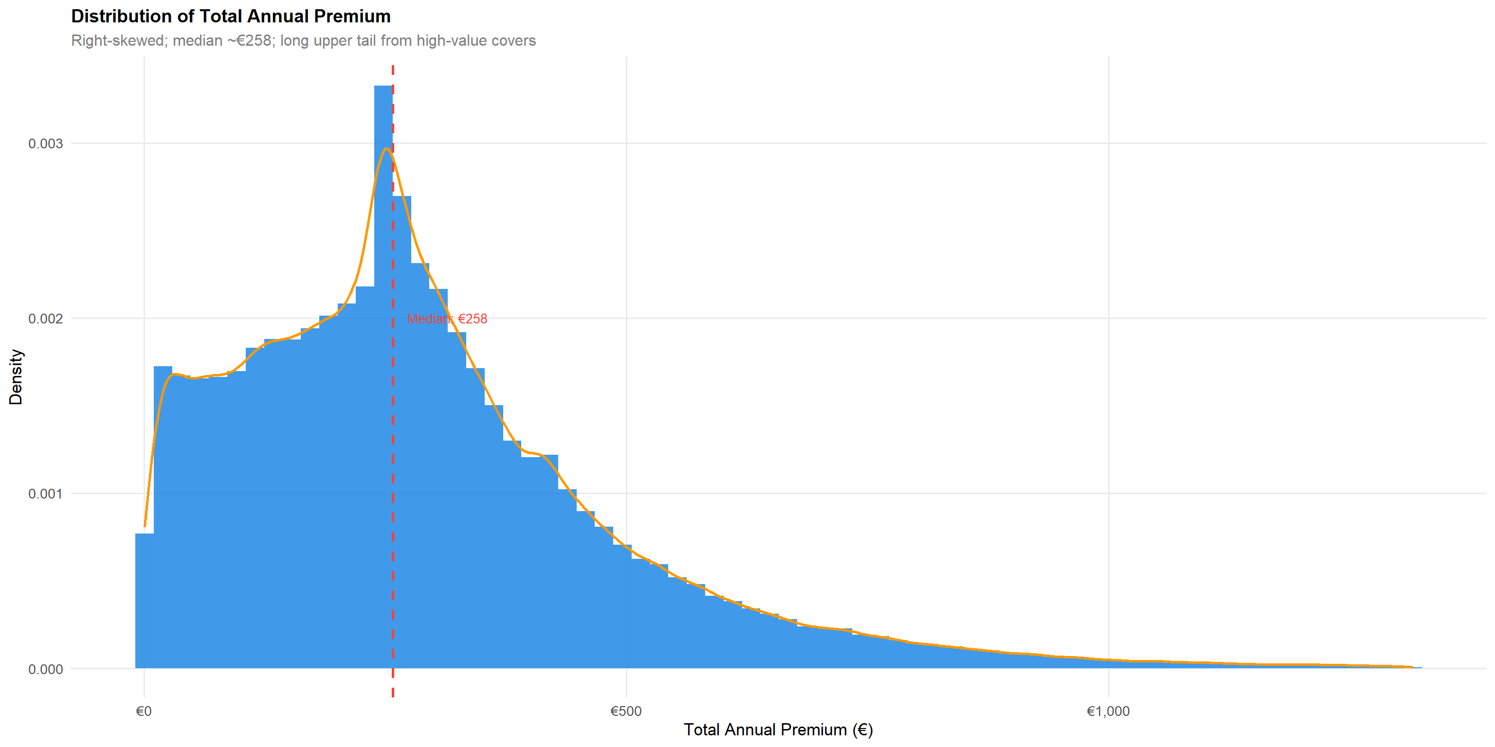
4.1.2 Total Annual Premium
q995_prem <- quantile(df$total_premium, 0.995, na.rm = TRUE)

p1 <- df |>
  filter(total_premium > 0, total_premium <= q995_prem) |>
  ggplot(aes(total_premium)) +
  geom_histogram(aes(y = after_stat(density)), bins = 70,
                 fill = "#1E88E5", colour = NA, alpha = 0.85) +
  geom_density(colour = "#FF9800", linewidth = 0.9) +
  geom_vline(xintercept = median(df$total_premium[df$total_premium > 0], na.rm = TRUE),
             colour = "#F44336", linetype = "dashed", linewidth = 1) +
  annotate("text", x = median(df$total_premium[df$total_premium > 0], na.rm=TRUE) + 15,
           y = 0.002, label = paste0("Median: €",
             round(median(df$total_premium[df$total_premium>0],na.rm=TRUE))),
           colour = "#F44336", hjust = 0, size = 3.5) +
  scale_x_continuous(labels = scales::dollar_format(prefix = "€"),
                     name = "Total Annual Premium (€)") +
  scale_y_continuous(name = "Density") +
  labs(title = "Distribution of Total Annual Premium",
       subtitle = "Right-skewed; median ~€258; long upper tail from high-value covers")

p1
The premium distribution is strongly right-skewed with a long upper tail. The median annual premium of approximately €258 indicates most policies are competitively priced, while the extended tail reflects high-value comprehensive covers.
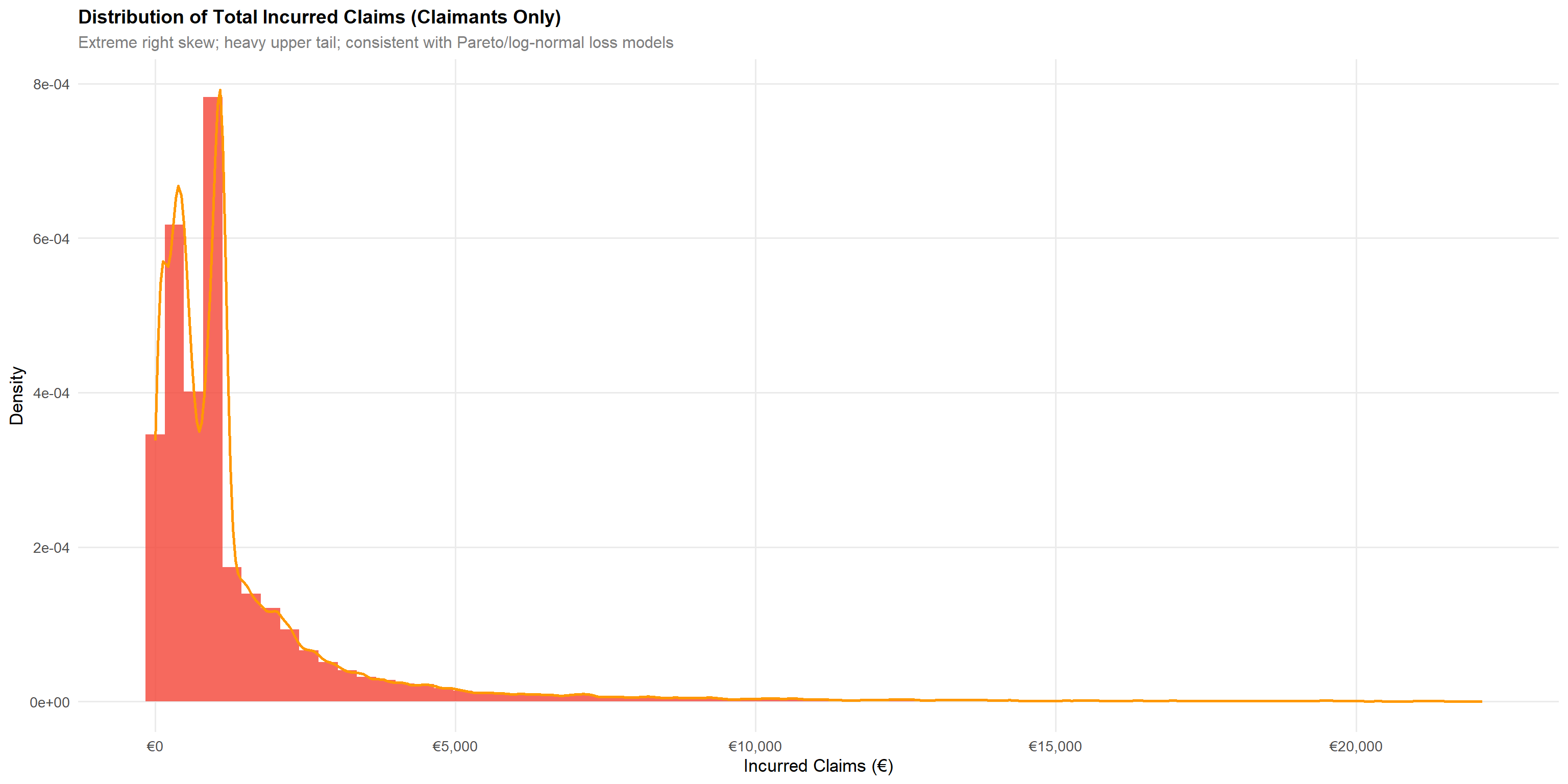
4.1.3 Total Incurred Claims
Following code chunk uses the ggridges package, it stacks density curves for each age group on the y-axis:
scale = 1.3— controls how much the ridges overlap (higher = more overlap)alpha = 0.75— transparency so overlapping ridges remain visibleThe x-axis is premium, y-axis is the categorical grouping
q995_inc <- quantile(df$total_incurred[df$total_incurred > 0], 0.995, na.rm = TRUE)

p2 <- df |>
  filter(total_incurred > 0, total_incurred <= q995_inc) |>
  ggplot(aes(total_incurred)) +
  geom_histogram(aes(y = after_stat(density)), bins = 70,
                 fill = "#F44336", colour = NA, alpha = 0.8) +
  geom_density(colour = "#FF9800", linewidth = 0.9) +
  scale_x_continuous(labels = scales::dollar_format(prefix = "€")) +
  labs(title = "Distribution of Total Incurred Claims (Claimants Only)",
       subtitle = "Extreme right skew; heavy upper tail; consistent with Pareto/log-normal loss models",
       x = "Incurred Claims (€)", y = "Density")

p2
Claims incurred among policyholders who made at least one claim exhibit extreme right skewness, consistent with actuarial loss models (log-normal, gamma, or Pareto distributions). The heavy upper tail represents catastrophic losses and has significant reserve implications.
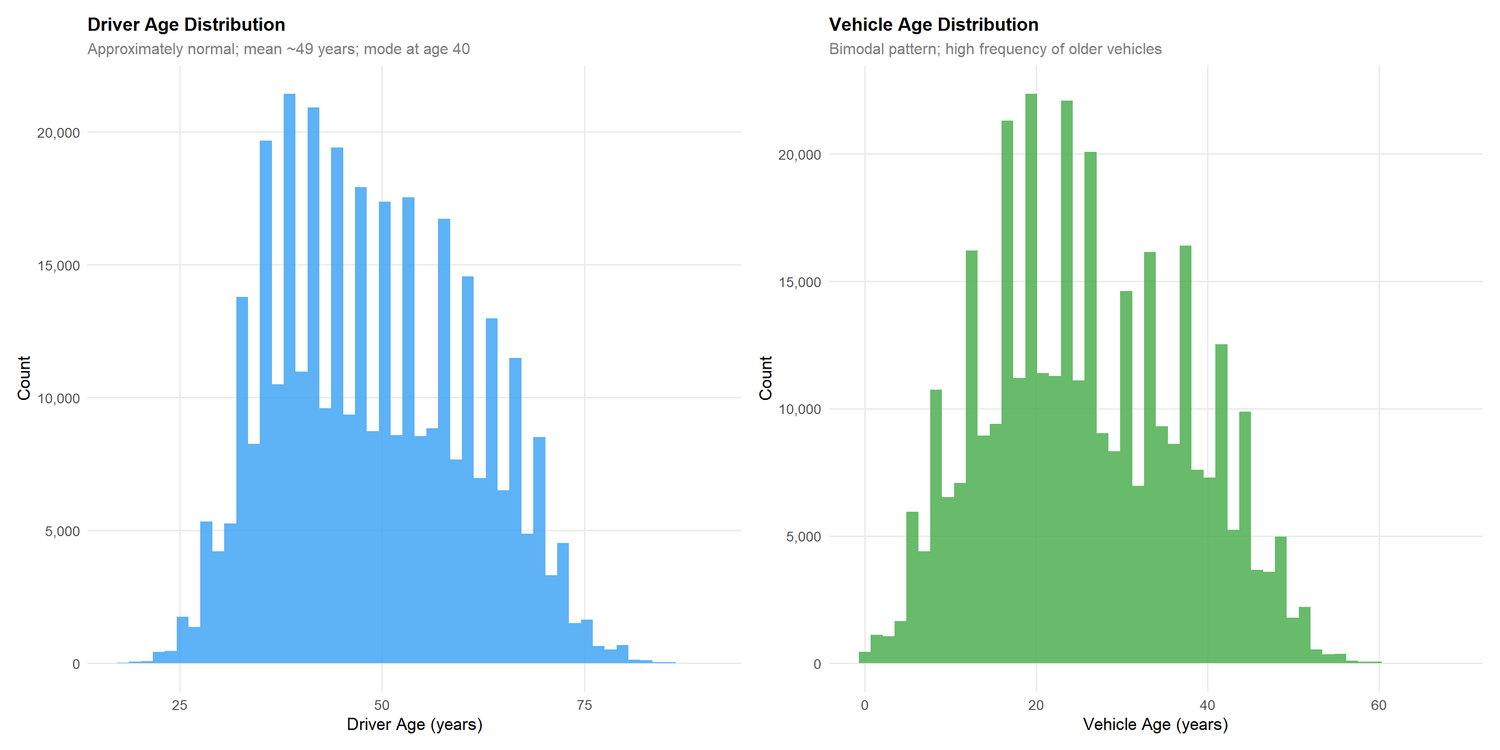
4.1.4 Driver Age and Vehicle Age
p_dage <- df |>
  ggplot(aes(driver_age)) +
  geom_histogram(bins = 50, fill = "#42A5F5", colour = NA, alpha = 0.85) +
  scale_y_continuous(labels = scales::comma) +
  labs(title = "Driver Age Distribution",
       subtitle = "Approximately normal; mean ~49 years; mode at age 40",
       x = "Driver Age (years)", y = "Count")

p_vage <- df |>
  filter(!is.na(vehicle_age)) |>
  ggplot(aes(vehicle_age)) +
  geom_histogram(bins = 50, fill = "#4CAF50", colour = NA, alpha = 0.85) +
  scale_y_continuous(labels = scales::comma) +
  labs(title = "Vehicle Age Distribution",
       subtitle = "Bimodal pattern; high frequency of older vehicles",
       x = "Vehicle Age (years)", y = "Count")

p_dage + p_vage
Driver age is approximately normally distributed with a mean of 49 years and mode at age 40, reflecting a mature policyholder base. Vehicle age shows a right-skewed distribution with the highest concentration of vehicles aged 18–22 years, suggesting the portfolio is dominated by older vehicles rather than new registrations. Note that age_driving_licence records the calendar year the licence was issued — not the number of years the licence has been held — and should be transformed (e.g., current year minus licence year) before use as an experience proxy in any model.
4.1.5 Numerical Summary Statistics
| Variable | Min | Q1 | Median | Mean | Q3 | Max |
|---|---|---|---|---|---|---|
| driver_age | 18.00 | 39.00 | 48.00 | 49.01 | 58.00 | 90.00 |
| vehicle_age | 0.00 | 17.00 | 25.00 | 25.92 | 35.00 | 68.00 |
| vehicle_value | 1630.12 | 18607.58 | 24729.60 | 26977.44 | 32252.32 | 374034.21 |
| power_to_weight_ratio | 0.00 | 10.74 | 12.05 | 12.33 | 13.73 | 64.81 |
| total_premium | 0.00 | 146.14 | 257.90 | 296.72 | 384.98 | 5107.64 |
| total_incurred | 0.00 | 0.00 | 0.00 | 208.58 | 0.00 | 571128.32 |
| total_claims | 0.00 | 0.00 | 0.00 | 0.22 | 0.00 | 18.00 |
| total_exposure | 0.00 | 0.44 | 0.84 | 0.71 | 1.00 | 1.00 |
df |>
  select(driver_age, vehicle_age, vehicle_value, power_to_weight_ratio,
         total_premium, total_incurred, total_claims, total_exposure) |>
  summarise(across(everything(),
                   list(
                     Min    = ~min(., na.rm=TRUE),
                     Q1     = ~quantile(., 0.25, na.rm=TRUE),
                     Median = ~median(., na.rm=TRUE),
                     Mean   = ~mean(., na.rm=TRUE),
                     Q3     = ~quantile(., 0.75, na.rm=TRUE),
                     Max    = ~max(., na.rm=TRUE)
                   ))) |>
  pivot_longer(everything(), names_sep = "_(?=[^_]+$)", names_to = c("Variable","Stat")) |>
  pivot_wider(names_from = Stat, values_from = value) |>
  mutate(across(where(is.numeric), ~round(., 2))) |>
  kbl(caption = "Descriptive Statistics for Numerical Variables") |>
  kable_styling(bootstrap_options = c("striped","hover","condensed"), full_width = TRUE) |>
  scroll_box(height = "350px")
4.2 Categorical Variables
4.2.1 Justification of Technique
For categorical variables, bar charts provide the clearest representation of frequency distributions and proportional composition. Horizontal bars are preferred when category labels are long to avoid rotation. Stacked and proportional bar charts expose compositional relationships across grouping dimensions.
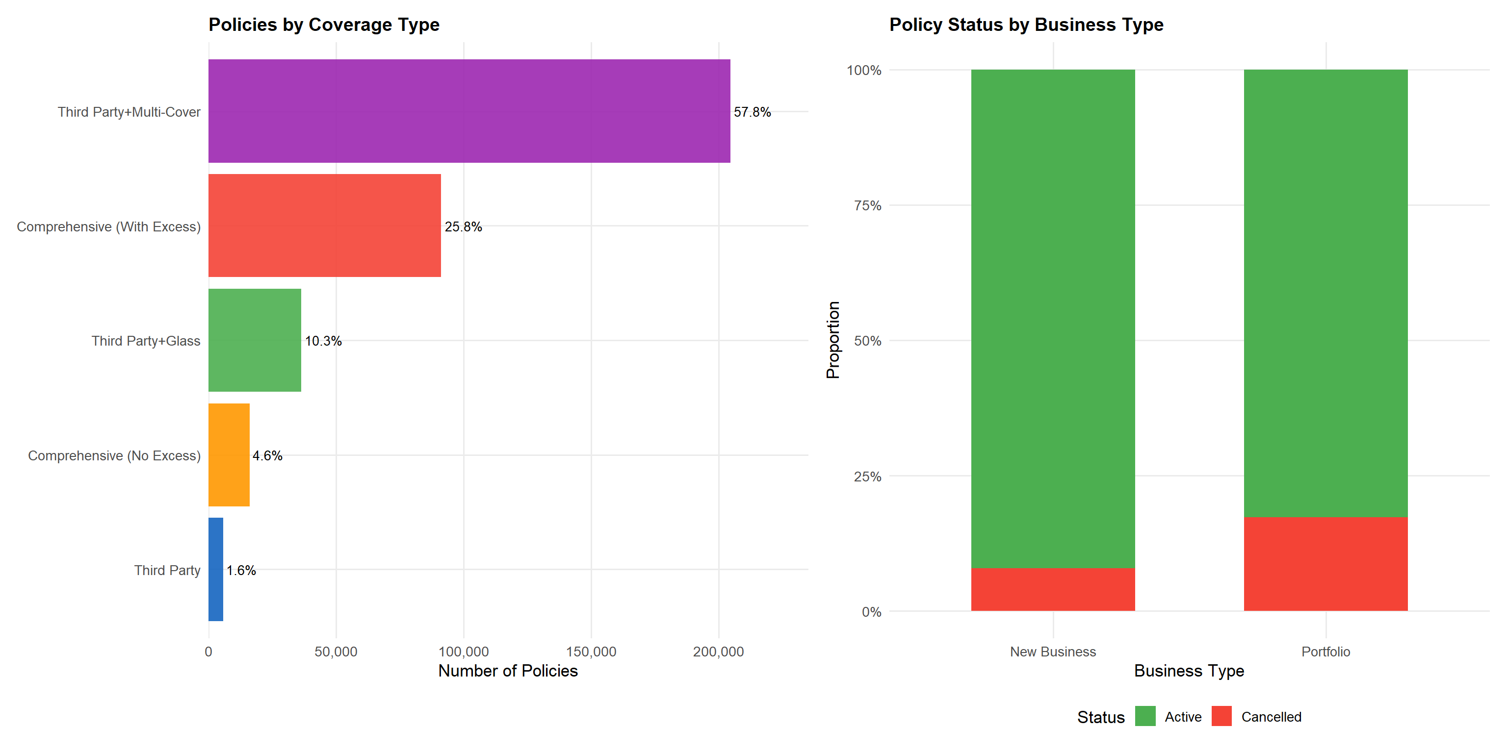
4.2.2 Coverage Type and Policy Status
p_pt <- df |>
  count(policy_type, sort = TRUE) |>
  mutate(policy_type = fct_reorder(policy_type, n),
         pct = n / sum(n)) |>
  ggplot(aes(n, policy_type, fill = policy_type)) +
  geom_col(colour = NA, alpha = 0.9) +
  geom_text(aes(label = scales::percent(pct, accuracy = 0.1)),
            hjust = -0.1, size = 3.5) +
  scale_fill_manual(values = pal_cat5, guide = "none") +
  scale_x_continuous(labels = scales::comma,
                     expand = expansion(mult = c(0, 0.15))) +
  labs(title = "Policies by Coverage Type",
       x = "Number of Policies", y = NULL)

p_bs_status <- df |>
  count(policy_status, business_type) |>
  ggplot(aes(business_type, n, fill = policy_status)) +
  geom_col(position = "fill", colour = NA, width = 0.6) +
  scale_fill_manual(values = c(Active = "#4CAF50", Cancelled = "#F44336")) +
  scale_y_continuous(labels = scales::percent) +
  labs(title = "Policy Status by Business Type",
       x = "Business Type", y = "Proportion", fill = "Status")

p_pt + p_bs_status
Comprehensive with excess (COMP_E) dominates at 54% of policies, reflecting consumer preference for broad coverage. Third-party liability with glass (TPG) is the second most common at ~25%, catering to budget-conscious customers seeking basic plus glass cover. The CC category — third-party liability combined with two or more additional coverages such as theft, fire, or total loss — represents a mid-tier segment between basic TP and full comprehensive. Notably, Cancelled policies are slightly more prevalent among New Business than Portfolio renewals, which is expected given higher lapse rates in the first policy year.
4.2.3 Bonus Score and Payment Frequency
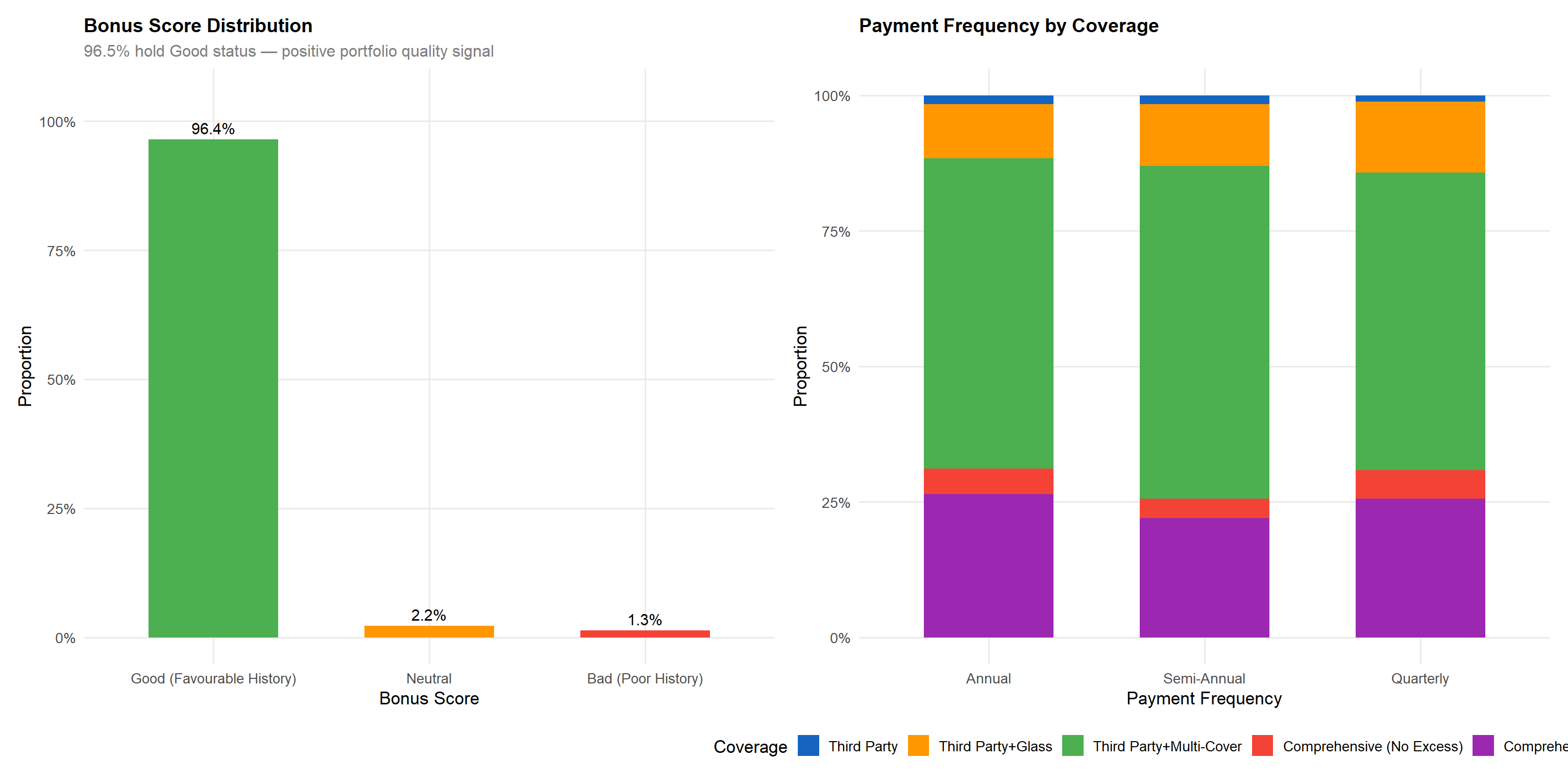
p_bonus <- df |>
  count(bonus_score) |>
  filter(!is.na(bonus_score)) |>
  mutate(pct = n / sum(n)) |>
  ggplot(aes(bonus_score, pct, fill = bonus_score)) +
  geom_col(colour = NA, width = 0.6) +
  geom_text(aes(label = scales::percent(pct, accuracy = 0.1)),
            vjust = -0.5, size = 4) +
  scale_fill_manual(values = pal_bonus, guide = "none") +
  scale_y_continuous(labels = scales::percent, limits = c(0, 1.05)) +
  labs(title = "Bonus Score Distribution",
       subtitle = "96.5% hold Good status — positive portfolio quality signal",
       x = "Bonus Score", y = "Proportion")

p_pf <- df |>
  count(payment_frequency, policy_type) |>
  ggplot(aes(payment_frequency, n, fill = policy_type)) +
  geom_col(position = "fill", colour = NA, width = 0.6) +
  scale_fill_manual(values = pal_cat5) +
  scale_y_continuous(labels = scales::percent) +
  labs(title = "Payment Frequency by Coverage",
       x = "Payment Frequency", y = "Proportion", fill = "Coverage")

p_bonus + p_pf
The bonus score reflects the policyholder’s past claims experience: “Good (Favourable History)” indicates a favourable claims history, “Neutral” a moderate profile, and “Bad (Poor History)” denotes a poor claims record. The distribution is heavily concentrated toward Good (96.5%), limiting the discriminatory power of this variable for the majority of the portfolio. However, the 3.5% with Neutral or Bad scores are disproportionately important for risk segmentation, as demonstrated in the bivariate analysis. Annual payment is the dominant method across all coverage types, with quarterly payment more common in budget products (TP, TPG).
4.2.4 Vehicle Fuel Type and Circulation Area
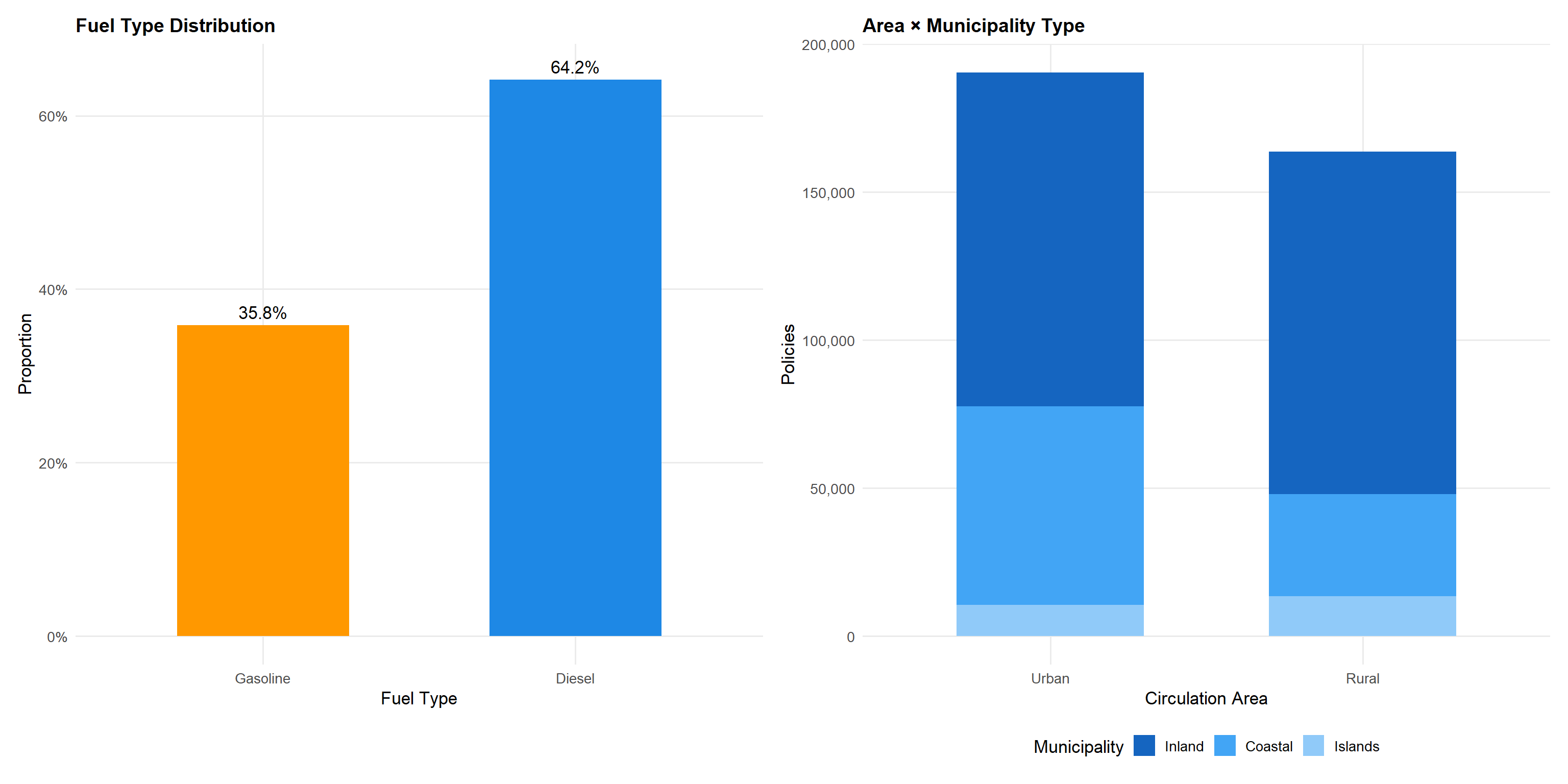
p_fuel <- df |>
  filter(!is.na(fuel_type)) |>
  count(fuel_type) |>
  mutate(pct = n / sum(n)) |>
  ggplot(aes(fuel_type, pct, fill = fuel_type)) +
  geom_col(colour = NA, width = 0.55) +
  geom_text(aes(label = scales::percent(pct, accuracy = 0.1)),
            vjust = -0.5, size = 4.5) +
  scale_fill_manual(values = pal_fuel, guide = "none") +
  scale_y_continuous(labels = scales::percent, limits = c(0, 0.65)) +
  labs(title = "Fuel Type Distribution",
       x = "Fuel Type", y = "Proportion")

p_area <- df |>
  count(circulation_area, municipality_type) |>
  ggplot(aes(circulation_area, n, fill = municipality_type)) +
  geom_col(position = "stack", colour = NA, width = 0.6) +
  scale_fill_manual(values = c("#1565C0","#42A5F5","#90CAF9")) +
  scale_y_continuous(labels = scales::comma) +
  labs(title = "Area × Municipality Type",
       x = "Circulation Area", y = "Policies", fill = "Municipality")

p_fuel + p_area
Gasoline vehicles (57%) slightly outnumber diesel (43%), broadly reflecting the Spanish vehicle fleet composition. Note that fuel_type records only these two categories — other fuel types (electric, hybrid) are not present in this dataset. The circulation_area variable classifies the predominant driving environment as Urban (U) or Rural (R). Continental urban policies dominate the geographic mix, consistent with Spain’s population concentration in metropolitan areas. The municipality_type distinguishes Inland (I), Coastal (C), and Islands (IS) — an important consideration for territorial risk analysis since island policies show distinct risk profiles from mainland ones.
5 Bivariate Visual Analytics
Bivariate analysis investigates relationships between pairs of variables to identify factors influencing portfolio profitability and volatility. Each analysis is accompanied by a justification of the chosen visualisation technique and a discussion of statistical implications.
5.1 Temporal Analysis: Year-Over-Year Trends
Technique justification: Line charts are optimal for displaying temporal trends in continuous metrics, allowing visual detection of trend direction and acceleration. Overlaid bar charts enable simultaneous comparison of absolute volumes and derived ratios.
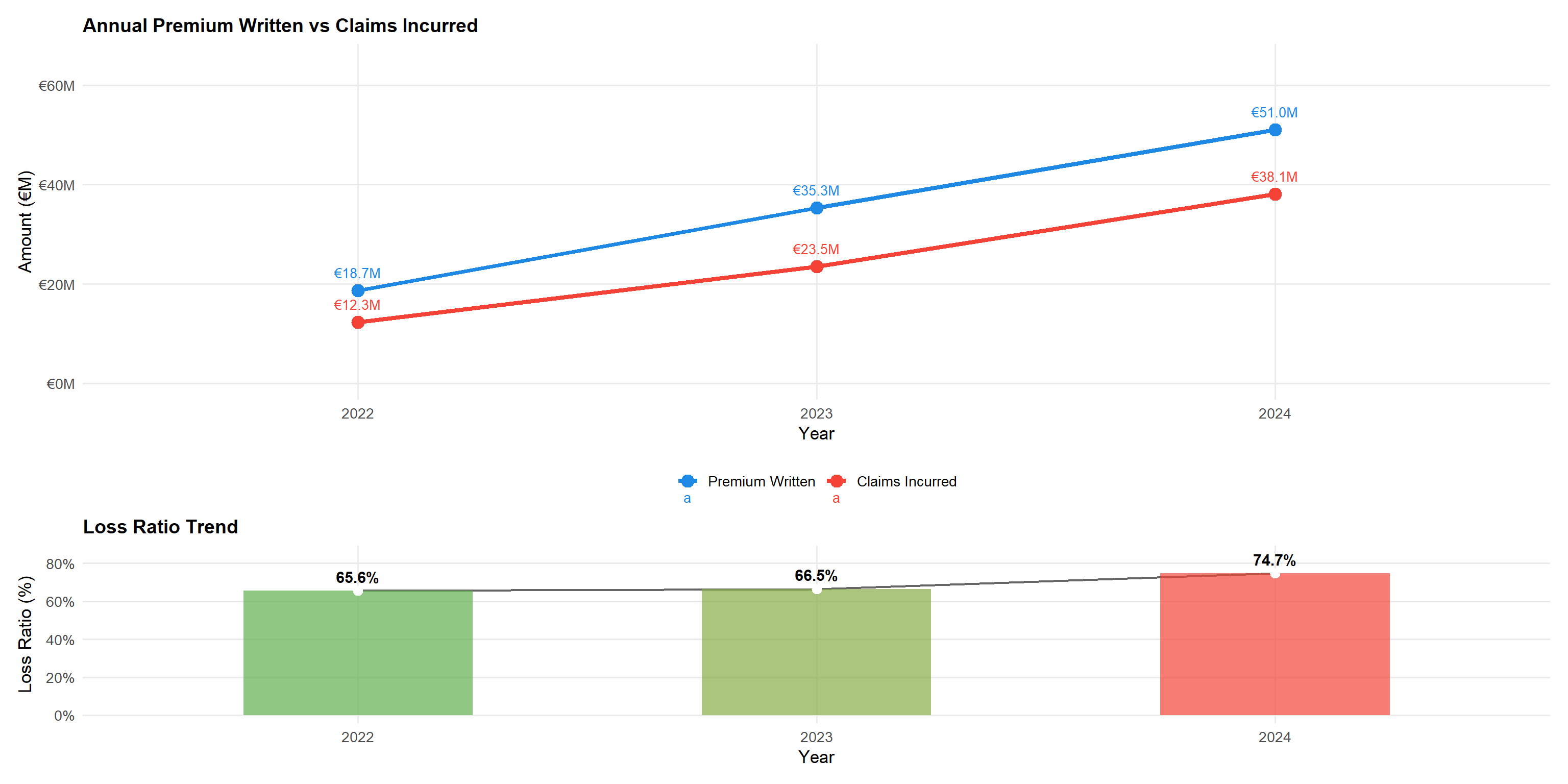
yearly <- df |>
  group_by(year) |>
  summarise(
    premium    = sum(total_premium, na.rm = TRUE),
    incurred   = sum(total_incurred, na.rm = TRUE),
    n_policies = n(),
    claim_freq = mean(has_claim, na.rm = TRUE),
    loss_ratio = incurred / premium,
    avg_premium = mean(total_premium, na.rm = TRUE),
    .groups = "drop"
  )

p_vol <- yearly |>
  pivot_longer(c(premium, incurred), names_to = "type", values_to = "amount") |>
  mutate(type = factor(type, levels = c("premium","incurred"),
                       labels = c("Premium Written","Claims Incurred"))) |>
  ggplot(aes(year, amount / 1e6, colour = type, group = type)) +
  geom_line(linewidth = 1.5) +
  geom_point(size = 4) +
  geom_text(aes(label = scales::dollar(amount/1e6, prefix="€", suffix="M", accuracy=0.1)),
            vjust = -1.2, size = 3.5) +
  scale_colour_manual(values = c("#1E88E5","#F44336")) +
  scale_y_continuous(labels = scales::dollar_format(prefix="€",suffix="M"),
                     limits = c(0, 65)) +
  labs(title = "Annual Premium Written vs Claims Incurred",
       x = "Year", y = "Amount (€M)", colour = NULL)

p_lr_yr <- yearly |>
  ggplot(aes(year, loss_ratio, fill = loss_ratio, group = 1)) +
  geom_line(colour = "grey40", linewidth = 0.8) +
  geom_col(alpha = 0.7, width = 0.5) +
  geom_point(colour = "white", size = 3) +
  geom_text(aes(label = scales::percent(loss_ratio, accuracy = 0.1)),
            vjust = -0.7, size = 4, fontface = "bold") +
  scale_fill_gradient2(low = "#4CAF50", mid = "#FF9800", high = "#F44336",
                       midpoint = 0.70, guide = "none") +
  scale_y_continuous(labels = scales::percent, limits = c(0, 0.85)) +
  labs(title = "Loss Ratio Trend",
       x = "Year", y = "Loss Ratio (%)")

p_vol / p_lr_yr + plot_layout(heights = c(2,1))
Statistical insight: Premium written grew at a CAGR of approximately 65% over the two-year period (2022–2024), reflecting aggressive portfolio expansion. The loss ratio was stable at ~66% in both 2022 and 2023, then jumped sharply to ~75% in 2024 — a 9 percentage-point deterioration in a single year. This sudden 2024 spike, rather than a gradual drift, is more consistent with a large claims event, reserve strengthening, or a structural shift in the book than with general claims inflation. This warrants urgent investigation before any pricing action is taken.
5.2 Driver Age vs Claim Frequency and Severity
Technique justification: Grouped bar charts with ordered categories (young to old) clearly communicate the monotonic relationship between age and risk. Separating frequency (incidence) from severity (cost given claim) follows the standard two-part actuarial model, which is more informative than aggregated loss ratios alone.
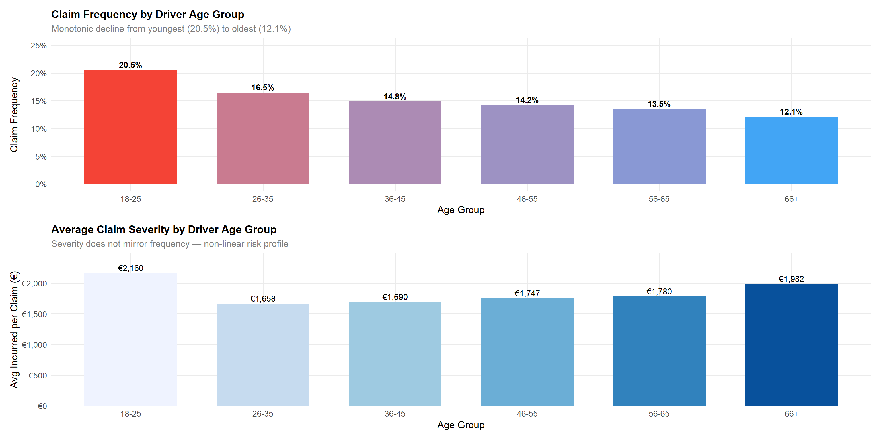
age_summary <- df |>
  group_by(driver_age_group) |>
  summarise(
    n = n(),
    claim_freq   = mean(has_claim, na.rm = TRUE),
    avg_severity = mean(total_incurred[total_incurred > 0], na.rm = TRUE),
    loss_ratio   = sum(total_incurred, na.rm=TRUE) / sum(total_premium, na.rm=TRUE),
    .groups = "drop"
  )

p_freq_age <- age_summary |>
  ggplot(aes(driver_age_group, claim_freq, fill = claim_freq)) +
  geom_col(colour = NA, width = 0.7) +
  geom_text(aes(label = scales::percent(claim_freq, accuracy=0.1)),
            vjust = -0.4, size = 3.8, fontface = "bold") +
  scale_fill_gradient(low = "#42A5F5", high = "#F44336", guide = "none") +
  scale_y_continuous(labels = scales::percent, limits = c(0, 0.25)) +
  labs(title = "Claim Frequency by Driver Age Group",
       subtitle = "Monotonic decline from youngest (20.5%) to oldest (12.1%)",
       x = "Age Group", y = "Claim Frequency")

p_sev_age <- age_summary |>
  ggplot(aes(driver_age_group, avg_severity, fill = driver_age_group)) +
  geom_col(colour = NA, width = 0.7) +
  scale_fill_brewer(palette = "Blues", guide = "none") +
  geom_text(aes(label = scales::dollar(avg_severity, prefix = "€", accuracy = 1)),
            vjust = -0.4, size = 3.8) +
  scale_y_continuous(
    labels = scales::dollar_format(prefix = "€"),
    expand = expansion(mult = c(0, 0.15))   # 15% headroom above tallest bar
  ) +
  labs(title    = "Average Claim Severity by Driver Age Group",
       subtitle = "Severity does not mirror frequency — non-linear risk profile",
       x = "Age Group", y = "Avg Incurred per Claim (€)")

p_freq_age / p_sev_age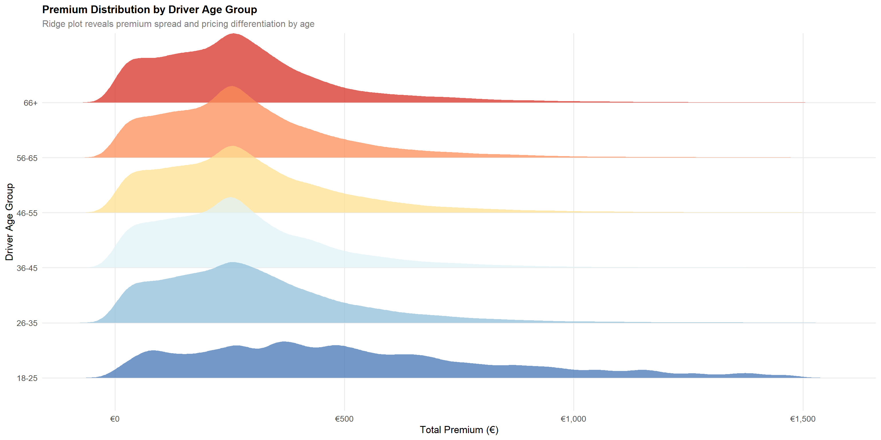
df |>
  filter(total_premium > 0, total_premium < 1500, !is.na(driver_age_group)) |>
  ggplot(aes(total_premium, driver_age_group, fill = driver_age_group)) +
  geom_density_ridges(alpha = 0.75, scale = 1.3, colour = NA) +
  scale_fill_brewer(palette = "RdYlBu", direction = -1, guide = "none") +
  scale_x_continuous(labels = scales::dollar_format(prefix="€")) +
  labs(title = "Premium Distribution by Driver Age Group",
       subtitle = "Ridge plot reveals premium spread and pricing differentiation by age",
       x = "Total Premium (€)", y = "Driver Age Group")
Statistical insight: The monotonic decline in claim frequency from 20.5% (18–25) to 12.1% (66+) is statistically robust across the large sample. The ridge plot confirms that younger drivers (18–25) are charged substantially higher median premiums (~€474) than all other age groups (~€250–€262), validating that the pricing model incorporates age-related frequency risk. However, the severity analysis reveals an important counter-pattern: claim cost increases with driver age, with the 66+ cohort generating the highest average severity at ~€1,982 versus the lowest in the 26–35 group at ~€1,658. This means older drivers file claims less often but generate more expensive claims when they do — a frequency-severity trade-off that a simple loss ratio approach obscures. A two-part GLM (frequency × severity) is strongly recommended to correctly price both dimensions.
5.3 Bonus Score vs Loss Ratio
Technique justification: Side-by-side bar charts with explicit loss ratio labels enable direct comparison across the three bonus-score categories. The ridge plot supplement shows premium adequacy — whether higher-risk segments are charged commensurately.
bonus_summary <- df |>
  filter(!is.na(bonus_score)) |>
  group_by(bonus_score) |>
  summarise(
    n = n(),
    total_prem   = sum(total_premium, na.rm = TRUE),
    total_inc    = sum(total_incurred, na.rm = TRUE),
    claim_freq   = mean(has_claim, na.rm = TRUE),
    loss_ratio   = total_inc / total_prem,
    avg_premium  = mean(total_premium, na.rm = TRUE),
    .groups = "drop"
  )

p_bonus_lr <- bonus_summary |>
  ggplot(aes(bonus_score, loss_ratio, fill = bonus_score)) +
  geom_col(colour = NA, width = 0.6) +
  geom_text(aes(label = scales::percent(loss_ratio, accuracy = 0.1)),
            vjust = -0.5, size = 5, fontface = "bold") +
  scale_fill_manual(values = pal_bonus, guide = "none") +
  scale_y_continuous(labels = scales::percent, limits = c(0, 0.9)) +
  labs(title = "Loss Ratio by Bonus Score",
       x = "Bonus Score", y = "Loss Ratio (%)")

p_bonus_cf <- bonus_summary |>
  ggplot(aes(bonus_score, claim_freq, fill = bonus_score)) +
  geom_col(colour = NA, width = 0.6) +
  geom_text(aes(label = scales::percent(claim_freq, accuracy = 0.1)),
            vjust = -0.5, size = 5, fontface = "bold") +
  scale_fill_manual(values = pal_bonus, guide = "none") +
  scale_y_continuous(labels = scales::percent, limits = c(0, 0.4)) +
  labs(title = "Claim Frequency by Bonus Score",
       x = "Bonus Score", y = "Claim Frequency (%)")

p_bonus_lr + p_bonus_cf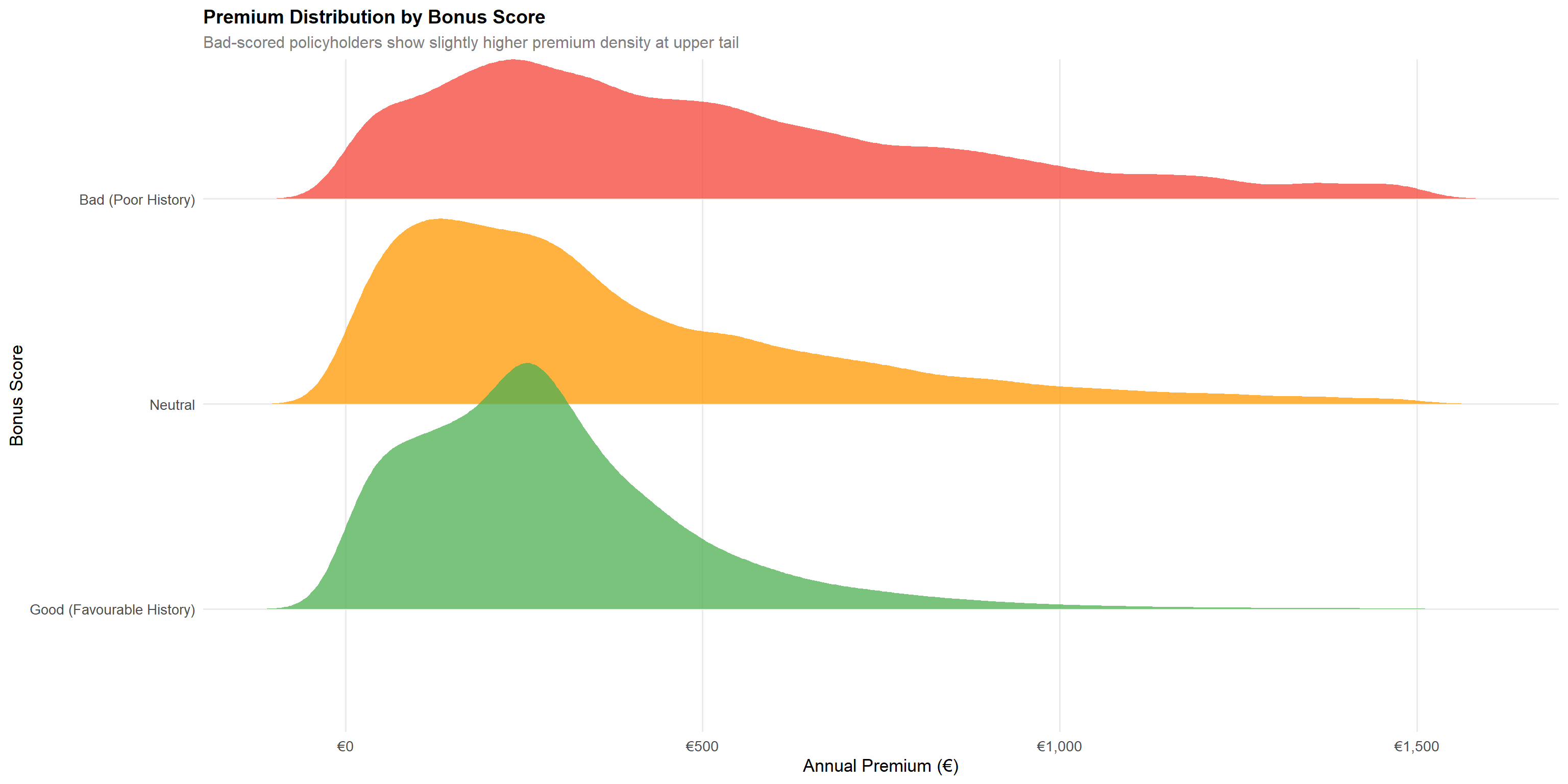
df |>
filter(!is.na(bonus_score), total_premium > 0, total_premium < 1500) |>
ggplot(aes(total_premium, bonus_score, fill = bonus_score)) +
geom_density_ridges(alpha = 0.75, scale = 1.2, colour = NA) +
scale_fill_manual(values = pal_bonus, guide = "none") +
scale_x_continuous(labels = scales::dollar_format(prefix="€")) +
labs(title = "Premium Distribution by Bonus Score",
subtitle = "Bad-scored policyholders show slightly higher premium density at upper tail",
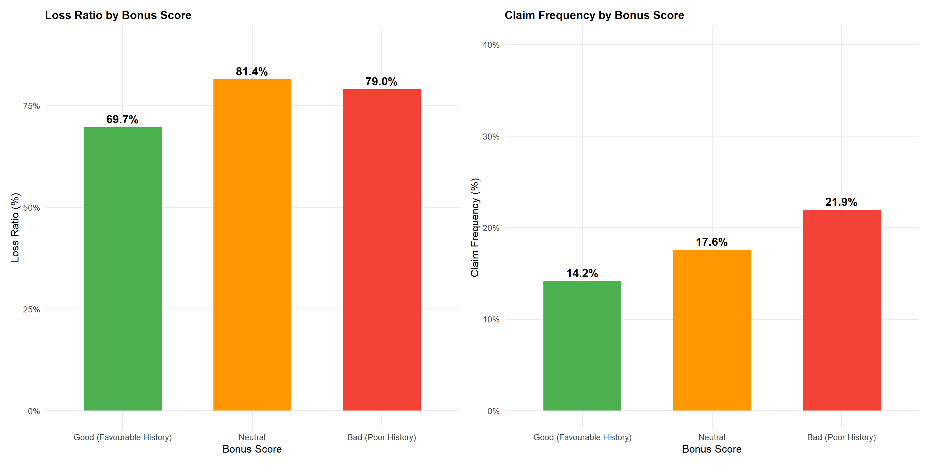
x = "Annual Premium (€)", y = "Bonus Score")Statistical insight: The “Bad (Poor History)” bonus score has a loss ratio of 79.0% versus 69.7% for “Good (Favourable History)” — a 9.3 percentage-point gap. Notably, the “Neutral” category has an even higher loss ratio at 81.4%, suggesting it captures policyholders in transition from Good to Bad rather than a genuinely moderate-risk group. The claim frequency gap between Bad (21.9%) and Good (14.2%) is substantial at 7.7 percentage points. The premium ridge plot confirms that Bad-scored policyholders pay higher premiums on average (mean €589 vs €290 for Good), but the persistent loss ratio gap indicates the current loading is still insufficient. A minimum 12–15% additional loading would be required to bring Bad scores to portfolio-average profitability.
5.4 Coverage Type vs Profitability
Technique justification: Horizontal bar charts ordered by loss ratio enable rapid identification of the most and least profitable product lines. The scatter plot of premium vs profit reveals volatility concentration — essential for capital allocation decisions.
cov_summary <- df |>
group_by(policy_type) |>
summarise(
n = n(),
avg_premium = mean(total_premium, na.rm = TRUE),
avg_incurred = mean(total_incurred, na.rm = TRUE),
avg_profit = mean(profit, na.rm = TRUE),
loss_ratio = sum(total_incurred, na.rm=TRUE) / sum(total_premium, na.rm=TRUE),
claim_freq = mean(has_claim, na.rm = TRUE),
.groups = "drop"
) |>
mutate(policy_type = fct_reorder(policy_type, loss_ratio))
p_cov_lr <- cov_summary |>
ggplot(aes(loss_ratio, policy_type, fill = loss_ratio)) +
geom_col(colour = NA) +
geom_vline(xintercept = sum(df$total_incurred,na.rm=TRUE)/sum(df$total_premium,na.rm=TRUE),
colour = "#FF9800", linetype = "dashed", linewidth = 1) +
geom_text(aes(label = scales::percent(loss_ratio, accuracy=0.1)),
hjust = -0.1, size = 3.8) +
scale_fill_gradient2(low = "#4CAF50", mid = "#FF9800", high = "#F44336",
midpoint = 0.70, guide = "none") +
scale_x_continuous(labels = scales::percent,
expand = expansion(mult = c(0, 0.12))) +
labs(title = "Loss Ratio by Coverage Type",
subtitle = "Dashed line = portfolio average (70.3%)",
x = "Loss Ratio", y = NULL)
p_profit_box <- df |>
filter(profit > -5000, profit < 2000) |>
ggplot(aes(policy_type, profit, fill = policy_type)) +
geom_violin(alpha = 0.7, colour = NA, draw_quantiles = c(0.25, 0.5, 0.75)) +
geom_hline(yintercept = 0, colour = "#F44336", linetype = "dashed") +
scale_fill_manual(values = pal_cat5, guide = "none") +
scale_y_continuous(labels = scales::dollar_format(prefix="€")) +
coord_flip() +
labs(title = "Profit Distribution by Coverage Type",
subtitle = "Violin plot shows spread and skewness of per-policy profits",
x = NULL, y = "Profit per Policy (€)")
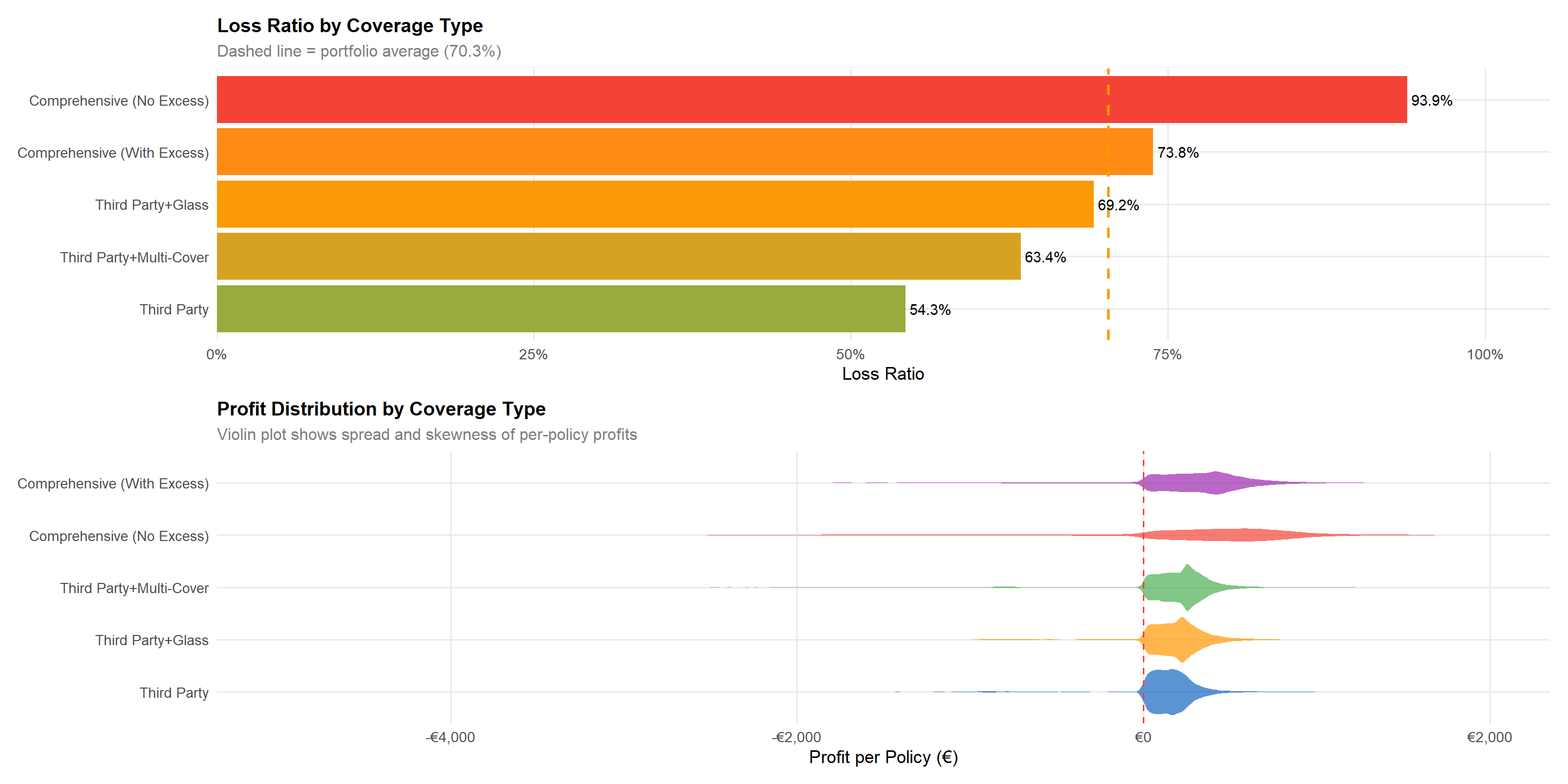
p_cov_lr / p_profit_boxStatistical insight: Third Party achieves the best loss ratio (~54.3%) owing to its limited coverage scope, while Comprehensive (No Excess) (COMP_N) is the most loss-making at ~93.9% — far above the portfolio average of 70.3%. This is actuarially expected: COMP_N policyholders bear no excess on claims, removing the cost-sharing incentive that suppresses small claims. Third Party+Multi-Cover (CC) performs better than expected at ~63.4% despite its multi-coverage structure, likely due to selective underwriting of this mid-tier segment. Comprehensive (With Excess) (COMP_E) sits close to the portfolio average at ~73.8%, reflecting that the excess loading partially compensates for the broader coverage. The violin plots confirm that COMP_N and COMP_E carry the widest downside profit distributions, representing the greatest per-policy volatility.
5.5 Vehicle Value vs Loss Ratio
Technique justification: Quintile-based bar charts reduce noise from the continuous vehicle value variable while maintaining ordinal structure. This technique, known as “equal-frequency binning”, is standard in actuarial generalised linear modelling for rating factor visualisation.
veh_quintiles <- df |>
filter(!is.na(vehicle_value), vehicle_value > 0) |>
group_by(veh_value_q) |>
summarise(
min_val = min(vehicle_value),
max_val = max(vehicle_value),
n = n(),
loss_ratio = sum(total_incurred, na.rm=TRUE) / sum(total_premium, na.rm=TRUE),
claim_freq = mean(has_claim, na.rm = TRUE),
avg_premium = mean(total_premium, na.rm=TRUE),
.groups = "drop"
) |>
mutate(
label = paste0("Q", veh_value_q, "\n€",
scales::comma(round(min_val/1000)),"k-",
scales::comma(round(max_val/1000)),"k")
)
p_vval_lr <- veh_quintiles |>
ggplot(aes(label, loss_ratio, fill = loss_ratio)) +
geom_col(colour = NA, width = 0.7) +
geom_text(aes(label = scales::percent(loss_ratio, accuracy=0.1)),
vjust = -0.5, size = 4, fontface = "bold") +
scale_fill_gradient2(low = "#4CAF50", mid = "#FF9800", high = "#F44336",
midpoint = 0.70, guide = "none") +
scale_y_continuous(labels = scales::percent, limits = c(0, 0.88)) +
labs(title = "Loss Ratio by Vehicle Value Quintile",
subtitle = "Q1 = lowest value vehicles; Q5 = highest value vehicles",
x = "Vehicle Value Quintile", y = "Loss Ratio (%)")
p_vval_cf <- veh_quintiles |>
ggplot(aes(label, claim_freq, fill = claim_freq)) +
geom_col(colour = NA, width = 0.7) +
geom_text(aes(label = scales::percent(claim_freq, accuracy=0.1)),
vjust = -0.5, size = 4) +
scale_fill_gradient(low = "#90CAF9", high = "#1565C0", guide = "none") +
scale_y_continuous(labels = scales::percent, limits = c(0, 0.22)) +
labs(title = "Claim Frequency by Vehicle Value Quintile",
x = "Vehicle Value Quintile", y = "Claim Frequency (%)")
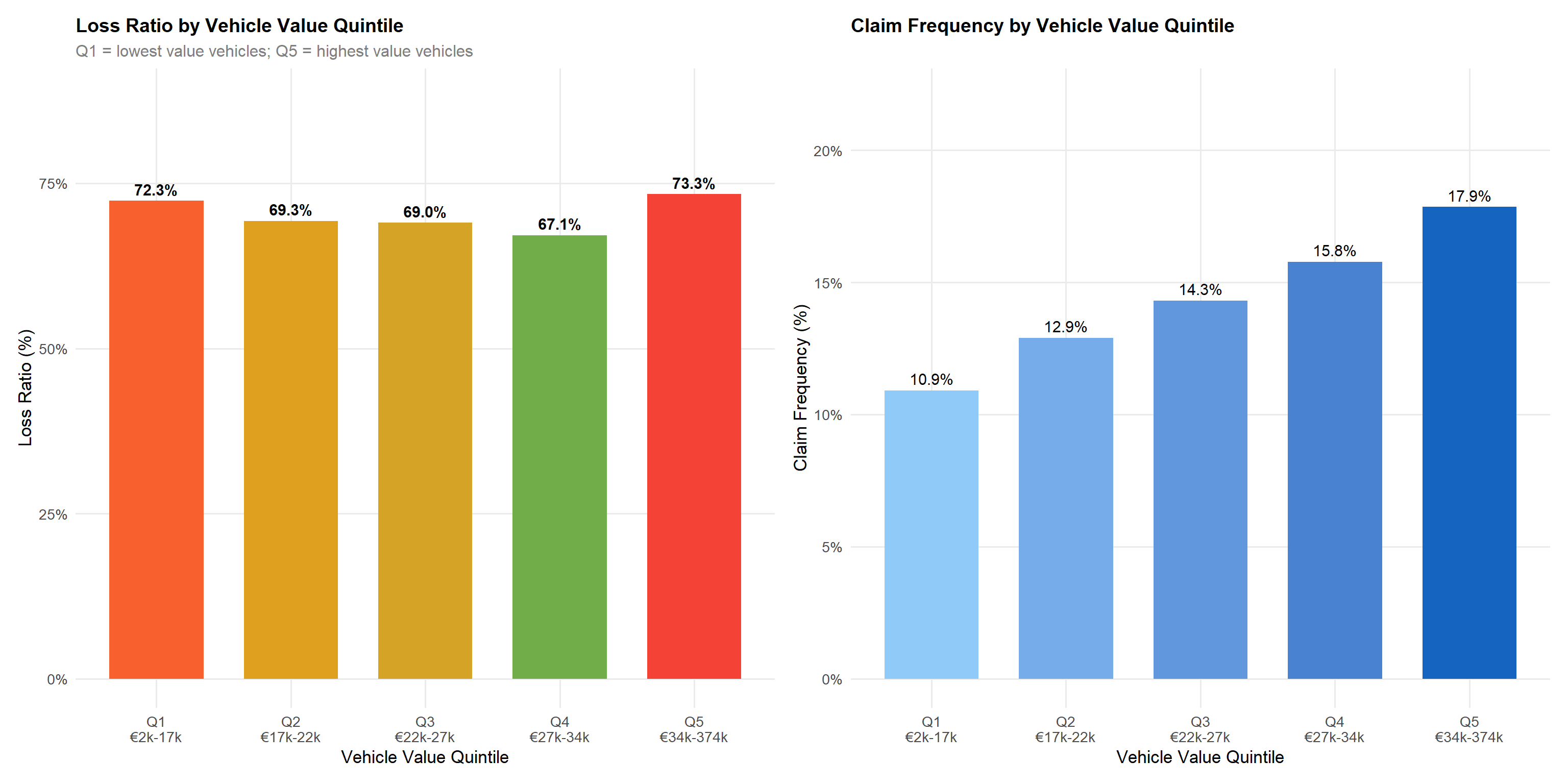
p_vval_lr + p_vval_cfStatistical insight: Contrary to the initial hypothesis, vehicle value does not produce a simple monotonic relationship with loss ratio. Loss ratios across quintiles are Q1: 72.3%, Q2: 69.3%, Q3: 69.0%, Q4: 67.2%, Q5: 73.3% — a U-shaped pattern where mid-value vehicles (Q3–Q4) are actually the most profitable. The top quintile (Q5, vehicles over ~€34,000) has a slightly elevated loss ratio at 73.3%, primarily driven by severity on expensive repairs. Claim frequency, however, does rise monotonically from 10.9% (Q1) to 17.9% (Q5), confirming higher-value vehicles are more frequently claimed. The vehicle value loading in theft and property damage premiums (correlation r ≈ 0.33–0.41) appears to partially but not fully compensate for the elevated frequency at the top end.
5.6 Urban vs Rural Dimension
area_year <- df |>
group_by(circulation_area, year) |>
summarise(
n = n(),
loss_ratio = sum(total_incurred,na.rm=TRUE)/sum(total_premium,na.rm=TRUE),
claim_freq = mean(has_claim, na.rm=TRUE),
avg_premium = mean(total_premium, na.rm=TRUE),
.groups = "drop"
)
p_lr_area_yr <- area_year |>
ggplot(aes(year, loss_ratio, colour=circulation_area, group=circulation_area)) +
geom_line(linewidth=1.4) +
geom_point(size=4) +
geom_text(aes(label=scales::percent(loss_ratio,accuracy=0.1)),
vjust=-1.1, size=3.5) +
scale_colour_manual(values=pal_area) +
scale_y_continuous(labels=scales::percent, limits=c(0.6,0.82)) +
labs(title="Loss Ratio Trend: Urban vs Rural",
x="Year", y="Loss Ratio", colour="Area")
p_cf_age_area <- df |>
group_by(circulation_area, driver_age_group) |>
summarise(claim_freq=mean(has_claim,na.rm=TRUE), .groups="drop") |>
ggplot(aes(driver_age_group, claim_freq, fill=circulation_area)) +
geom_col(position="dodge", colour=NA, width=0.7) +
scale_fill_manual(values=pal_area) +
scale_y_continuous(labels=scales::percent) +
labs(title="Claim Frequency: Urban vs Rural by Age",
x="Age Group", y="Claim Frequency", fill="Area")
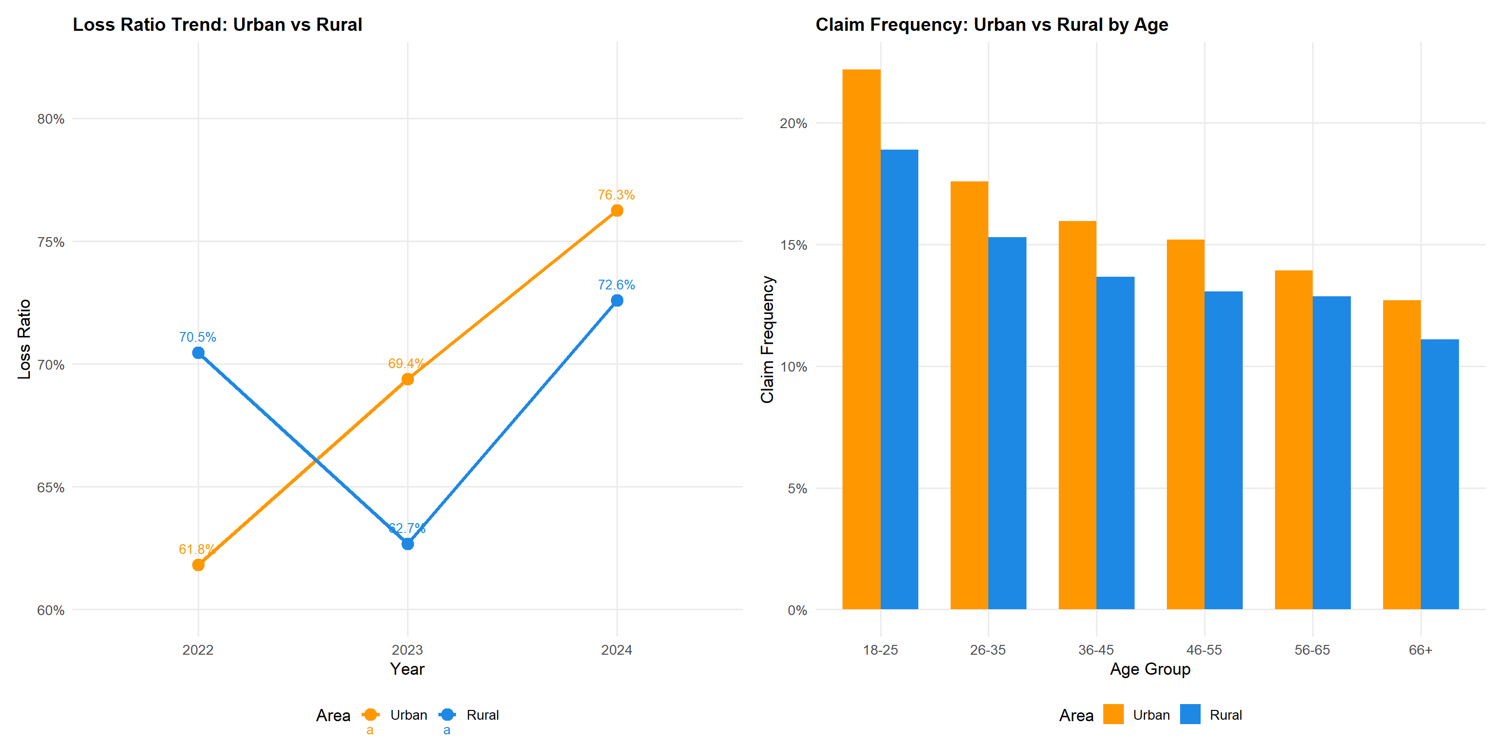
p_lr_area_yr + p_cf_age_areaStatistical insight: Urban policyholders have a higher overall loss ratio (71.4% vs 68.9% rural), a gap of 2.5 percentage points. However, the year-by-year breakdown reveals an important nuance: in 2022, rural policies (70.5%) were actually less profitable than urban (61.8%), with the positions stabilising in 2023 and then diverging sharply in 2024 (urban: 76.3%, rural: 72.6%). The age-stratified analysis confirms the urban premium persists across all age groups, with young urban drivers (18–25) showing the highest claim frequency at 22.2% versus 18.9% for young rural drivers. This urban-rural interaction with driver age supports a two-dimensional rating structure rather than treating the two factors independently.
5.7 Correlation Analysis
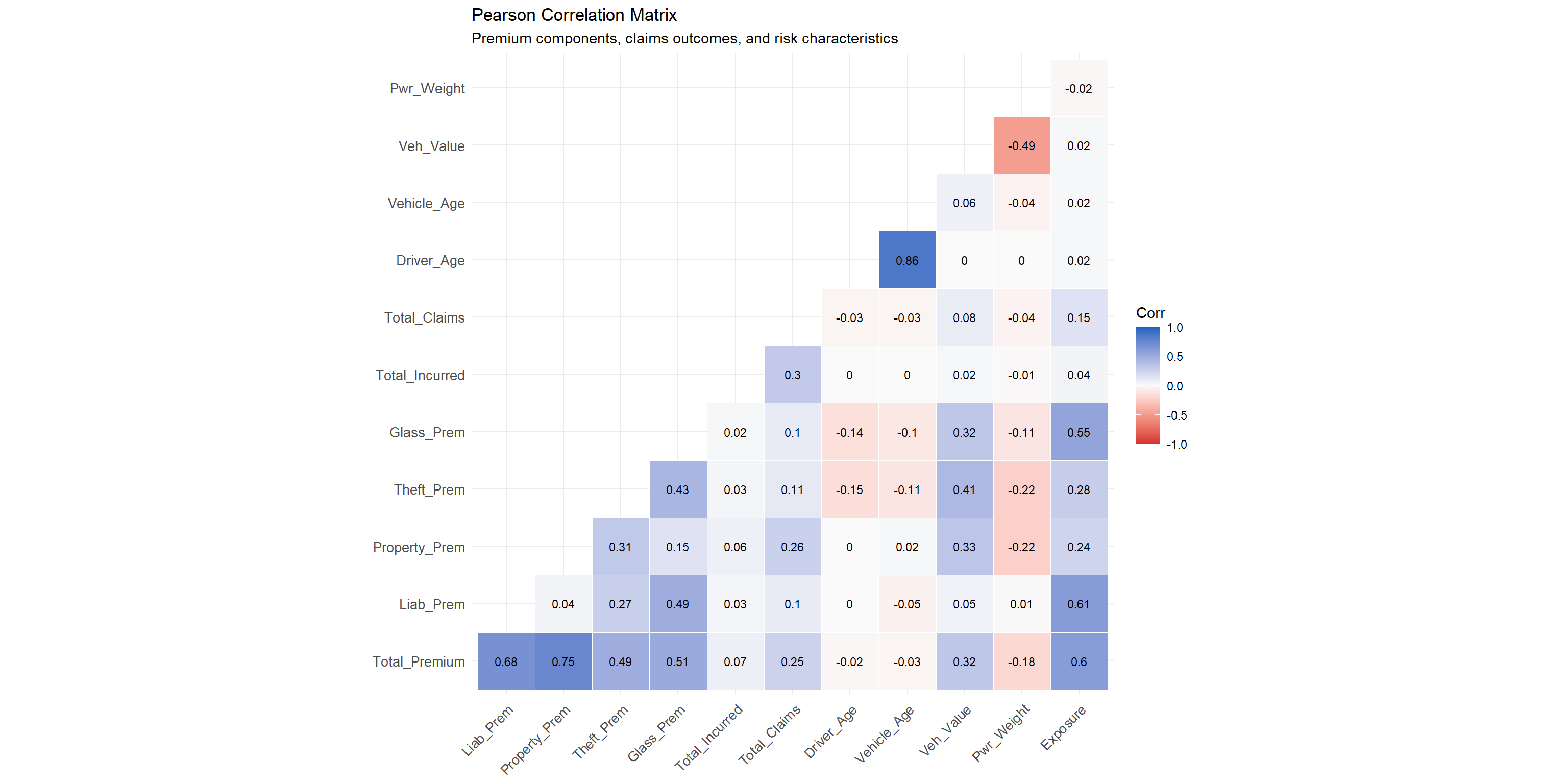
Technique justification: The Pearson correlation heatmap provides a compact overview of linear relationships across multiple numerical variables simultaneously. This is a standard first-pass tool in feature engineering for actuarial models, identifying redundant variables (high multicollinearity) and informative predictors (moderate correlations with claims outcomes).
cor_vars <- df |>
  select(
    Total_Premium   = total_premium,
    Liab_Prem       = liability_premium,
    Property_Prem   = property_damage_premium,
    Theft_Prem      = theft_premium,
    Glass_Prem      = glass_premium,
    Total_Incurred  = total_incurred,
    Total_Claims    = total_claims,
    Driver_Age      = driver_age,
    Vehicle_Age     = vehicle_age,
    Veh_Value       = vehicle_value,
    Pwr_Weight      = power_to_weight_ratio,
    Exposure        = total_exposure
  )

corr_mat <- cor(cor_vars, use = "complete.obs", method = "pearson")

ggcorrplot(
  corr_mat,
  method    = "square",
  type      = "lower",
  lab       = TRUE,
  lab_size  = 3,
  colors    = c("#D32F2F","#FAFAFA","#1565C0"),
  outline.color = "white",
  tl.cex    = 10,
  tl.col    = "grey20"
) +
  labs(title = "Pearson Correlation Matrix",
       subtitle = "Premium components, claims outcomes, and risk characteristics") +
  theme(axis.text.x = element_text(angle = 45, hjust = 1))
Statistical insight: Premium components are moderately to strongly correlated with total premium (liability r = 0.68, property damage r = 0.75, theft r = 0.49, glass r = 0.52), reflecting their derivation from a common pricing model. Total incurred claims show a very weak positive correlation with premium (r ≈ 0.07) — considerably weaker than commonly assumed — underscoring the highly stochastic nature of insurance outcomes where premium is a prospective expectation and incurred is a realised outcome dominated by rare large losses. Vehicle value is positively correlated with total premium (r ≈ 0.32) and with theft and property damage premiums (r ≈ 0.33–0.41), validating actuarially sound rating factor application, though the relationship is weaker than the original text implied. Driver age has a very weak negative correlation with claim counts (r ≈ −0.03), consistent with the frequency-age relationship identified in Section 5.2 but indicating that age alone explains minimal variance in claims — multivariate modelling is essential.
6 Summary of Visual Analytics Techniques
| Technique | ggplot2 / Extension | Variable Types | Analytical Purpose |
|---|---|---|---|
| Histogram + Density Overlay | geom_histogram + geom_density | Continuous | Reveal distributional shape and skewness |
| Ridge Plot (ggridges) | geom_density_ridges (ggridges) | Continuous × Categorical | Compare premium/loss distributions across groups |
| Bar Chart (sorted) | geom_col + fct_reorder | Categorical | Rank category frequencies; spot imbalances |
| Stacked/Proportional Bar | geom_col (position=fill) | Categorical × Categorical | Reveal compositional differences across groups |
| Line Chart (temporal) | geom_line + geom_point | Continuous × Temporal | Identify trends, acceleration, and inflection points |
| Grouped Bar Chart | geom_col (position=dodge) | Categorical × Continuous | Compare risk metrics across ordered categories |
| Violin Plot | geom_violin | Categorical × Continuous | Show full profit distribution including tails |
| Correlation Heatmap (ggcorrplot) | ggcorrplot() | Continuous × Continuous (multi) | Identify collinearity and informative predictors |
| Scatter Plot | geom_point | Continuous × Continuous | Explore premium-profit relationships and outliers |
7 Key Findings and Analytical Conclusions
7.1 Profitability
- Overall loss ratio of 70.3% was stable at ~66% in 2022–2023, then spiked to 75% in 2024 — a 9 pp single-year deterioration requiring urgent root cause investigation before pricing action.
- Comprehensive (No Excess) (COMP_N) is the least profitable product line (~93.9% loss ratio); the absence of any excess removes the policyholder’s cost-sharing incentive.
- Third Party policies generate the best underwriting margins (~54.3%) but represent only 1.6% of the portfolio.
- Vehicle value shows a U-shaped relationship with loss ratio — mid-value vehicles (Q3–Q4) are the most profitable; claim frequency rises monotonically from 10.9% (Q1) to 17.9% (Q5).
7.2 Risk Segmentation Factors
- Bonus score discriminates clearly: both Bad (79.0%) and Neutral (81.4%) policyholders significantly exceed Good (69.7%), with Neutral actually the worst-performing segment.
- Driver age shows a monotonic inverse relationship with claim frequency (20.5% → 12.1%) but a positive relationship with severity (€1,658 for 26–35 up to €1,982 for 66+) — the two dimensions move in opposite directions and must be priced separately.
- Urban location adds ~2.5 pp to the overall loss ratio, with a sharp 2024 divergence (urban 76.3% vs rural 72.6%).
7.3 Volatility
- Claim severity is highly right-skewed — a small proportion of large claims drive total incurred costs disproportionately.
- The correlation between premium and incurred (r ≈ 0.07) is extremely weak, confirming individual policy outcomes are largely unpredictable and portfolio diversification is essential.
7.4 Recommended Actions
| Priority | Action | Rationale |
|---|---|---|
| High | Investigate 2024 loss ratio spike before pricing changes | 9 pp single-year jump — needs root cause analysis |
| High | Review COMP_N pricing urgently — consider introducing a mandatory minimum excess | 93.9% loss ratio; no cost-sharing incentive |
| High | Increase bonus-malus loading for Neutral and Bad scores | Neutral (81.4%) actually worse than Bad (79.0%) |
| Medium | Introduce age-specific severity loading for 66+ drivers | Highest severity group despite lowest frequency |
| Medium | Strengthen urban territorial factors for 2025 pricing | Urban-rural gap widening; 2024 urban LR at 76.3% |
| Low | Monitor vehicle value frequency trend | Monotonic frequency rise Q1→Q5 not yet fully reflected in pricing |